Things Are Looking a Little Different
June 1, 2022
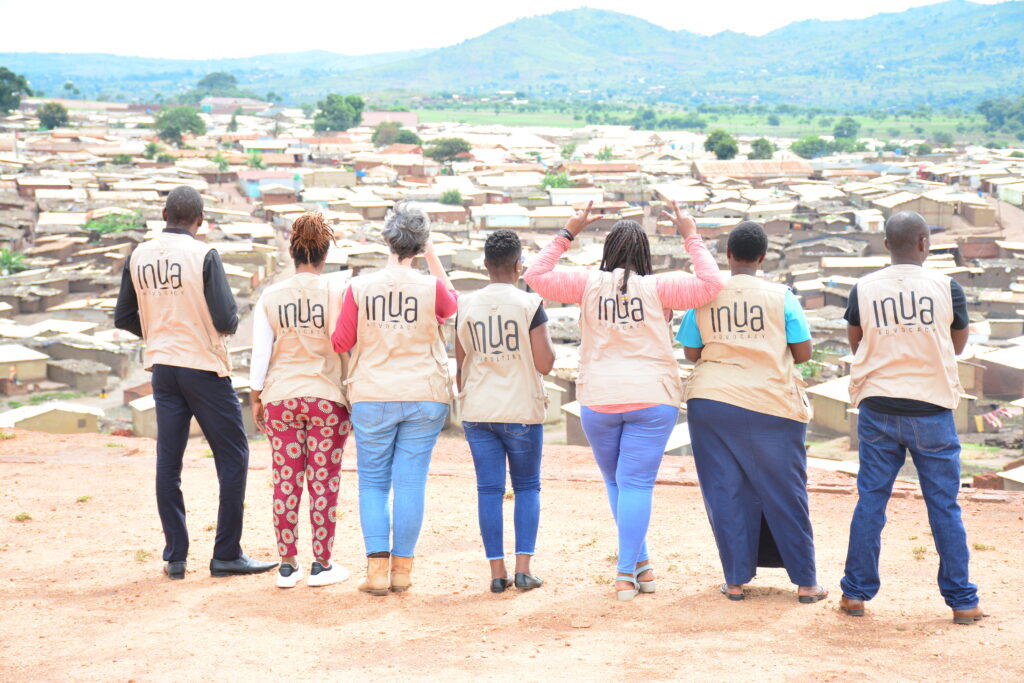
Everything is looking a little different around here these days! We have said goodbye to the orange, dropped the 'international' part of our name and said hello to a whole new look. We have gone through a whole rebranding process with our friends over at Sling Agency, and we have loved finally being able to reveal our what we have been working on. Every element has been thought through and created to encapsulate the heart of who we are as an organisation. Although there has been a lot of change; our mission, vision and who we are remains the same.
Our icon stands for: Love. Eternity. Together. Our ident aims to bring together the threads of heart, connectivity and eternity. It begins with the 'L' shape of Links and flows into the shape of a heart, visually forming an 'and' ampersand inside. This represents 'togetherness' and also forms the shape of an eternity symbol. It's all wrapped up in a dynamic flow to symbolise together, unity and action.
As a Christian organisation, we believe in the concept of Jesus' mission being of Heaven invading earth, hence eternity breaking out in the here and now. We believe that love is stronger than death, hence the heart symbolism. And finally, we believe that we are in it together, hence the connectivity.
We love that our new look is bold and fun and brings across the character and voice of our organisation so well. We hope you love it too!
In it together.
Something Exciting is Coming!
July 1, 2026
Very soon, we'll be launching our new appeal focused on business, sustainability and enterprise - bringing together our incredible UK business partners with our dedicated partners around the world who are equipping people with the skills, training and opportunities they need to build brighter, more sustainable futures.
.jpg)
Thank You Anya!
July 1, 2026
Recently we had the pleasure of welcoming Anya to Links for her work experience placement. It was fantastic to have her as part of the team and to share with her the work that goes on behind the scenes to support communities around the world.
%20(4).png)
Partnering with the Local Church for Global Impact
July 1, 2026
Every so often, we get a moment to step back and join with close friends and partners to see the bigger story we’re part of. Links Sundays with our Church partners is one of those moments. It reminds us that mission isn’t something a few specialists do 'over there', it’s the calling of the whole Church, the whole people of God, joining His work of restoring shalom on earth as in Heaven.
%20(8).jpg)
United in Purpose: What the World Cup Teaches Us About Our Mission
July 1, 2026
Every few years the world pauses to watch something extraordinary. Flags wave, anthems rise and nations pour onto the global stage in a celebration of colour, culture and collective hope. The World Cup becomes a glimpse of what happens when tribes, tongues and nations gather around a shared purpose.
%20(1).jpg)